Krystallis Website
- Role:
- UI/UX designer
- Scope:
- UX strategy, information architecture, visual identity, wireframes (lo‑fi and hi‑fi), responsive design, interactive prototype
Problem
The menu was buried. The hours kept moving.
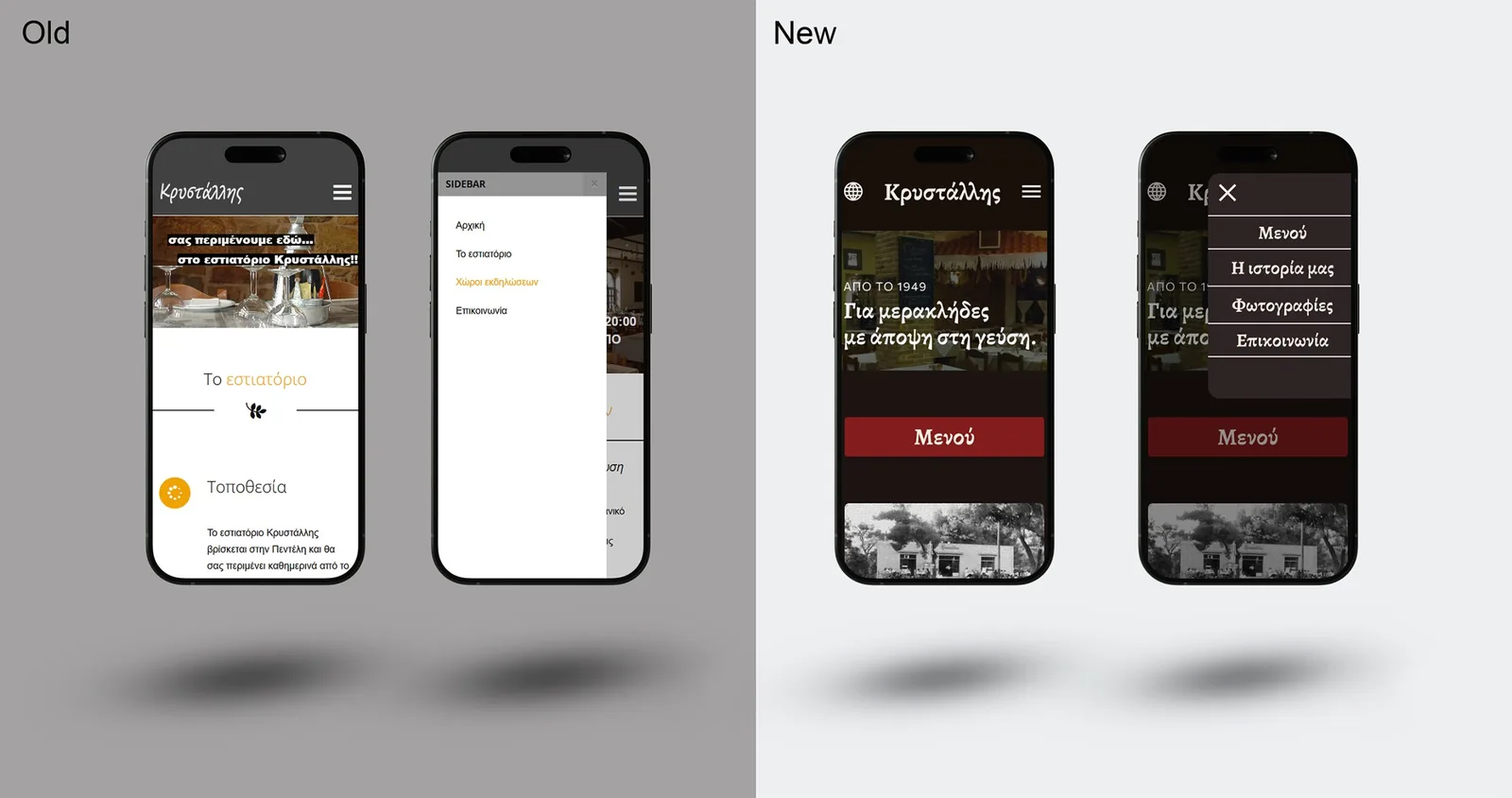
People come to book a table or check the menu. The menu hid in the Contact page, hours were split between the footer and the Events page, and there was no English version for tourists.
Visitors gave up before finding what they came for.
Solution
Four pages. Everything else in the footer.
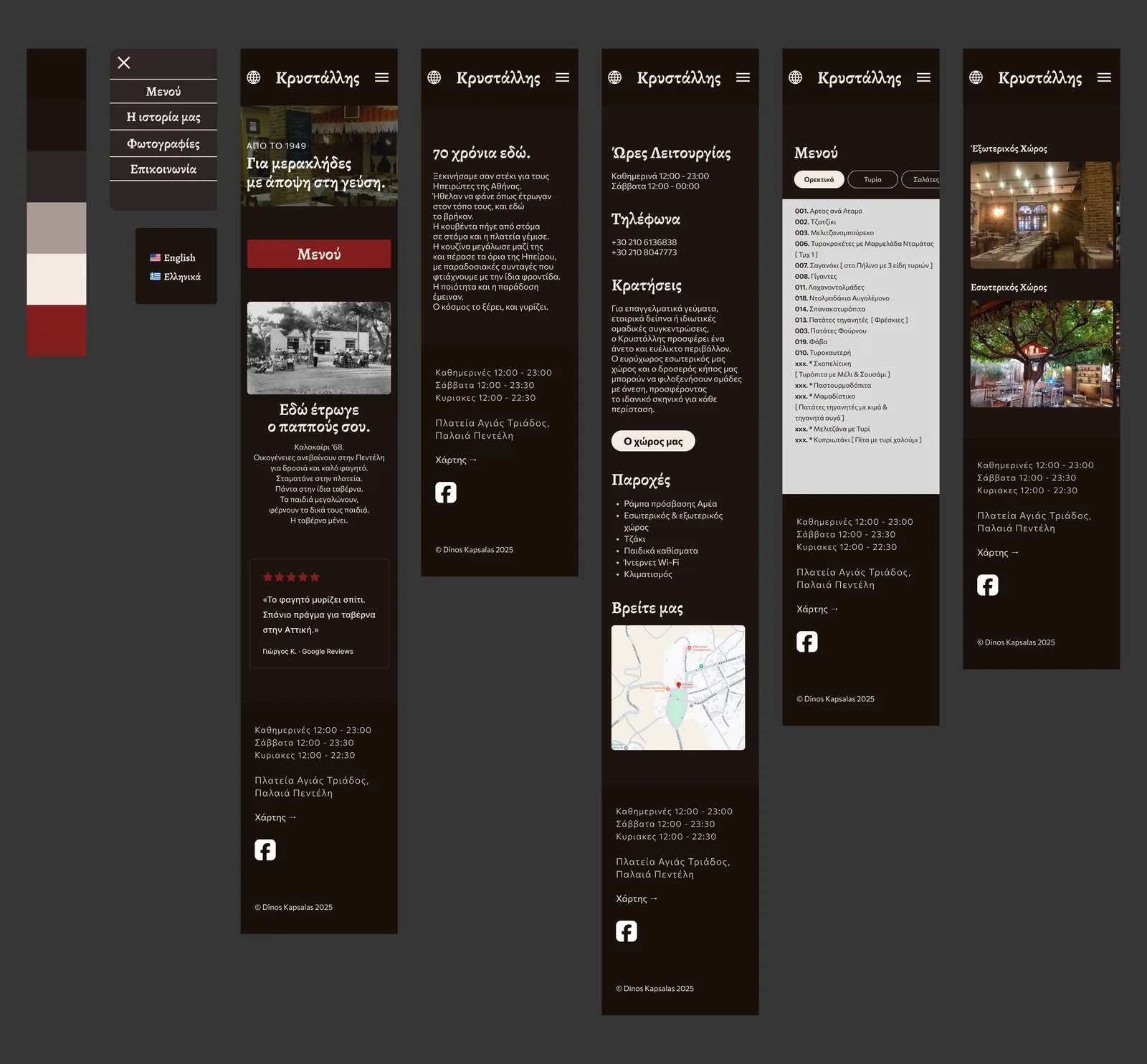
The site now has four pages: Menu, Our story, Photos and Contact. The Greek/English switch is in the header. Hours, phones, address and the map link sit in one footer on every page, so they’re never more than a scroll away.
On desktop the menu opens like a real paper menu. On mobile it becomes a list you can filter by category tabs. Events no longer have their own page: reservations, amenities and the map all live in Contact, which answers “can we bring a group?” in one place.
The look borrows from the taverna itself: dark wood, cream linen, a deep red, and a 1949 photo of the original building.
Result
Land, check the menu, book.
No hunting for buried details. No confusion between pages that should be one.